DESCRIPTION
Client: NASA
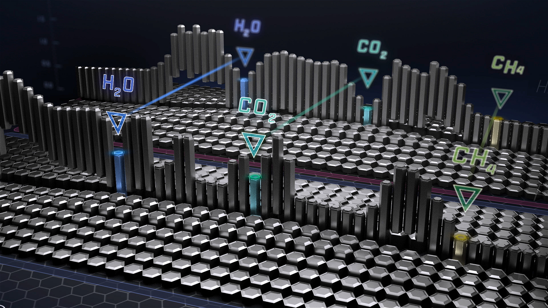
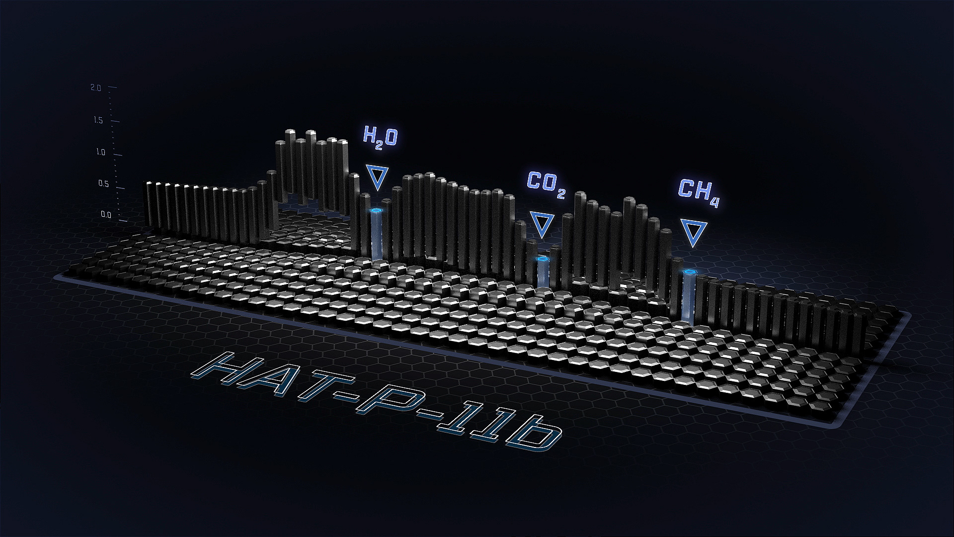
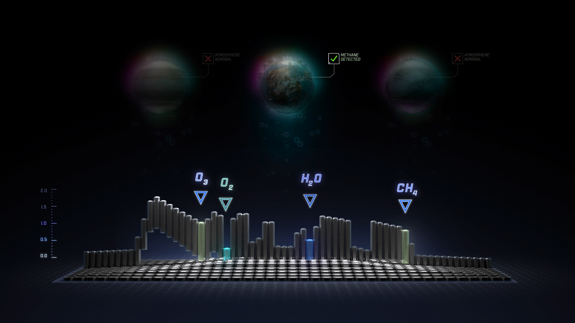
As a visualization fellow at NASA's Goddard Space Flight Center, I worked with project scientists to develop a concept for displaying spectroscopy data in support of the LUVOIR mission. The result was a visual system driven by real data.
The system's motion reflects how early coarse data is gradually refined to highlight key gas compounds, and its styling reflects the hexagonal geometry of LUVOIR’s physical mirrors.
SCIENCE BACKGROUND
If life existed on a distant planet, how would we know? NASA’s LUVOIR mission (Large UV/Optical/IR Surveyor), a forthcoming observational spacecraft, will look at planets' atmospheric composition for gases that could indicate life.
"Exoplanet atmospheres are the key for life detection on a planet beyond our solar system. The premise is that life produces gases as by-products to metabolism, and that some of the gases will accumulate in a habitable planet atmosphere and in principle can be detected by spectroscopy." –Sara Seager and William Bains
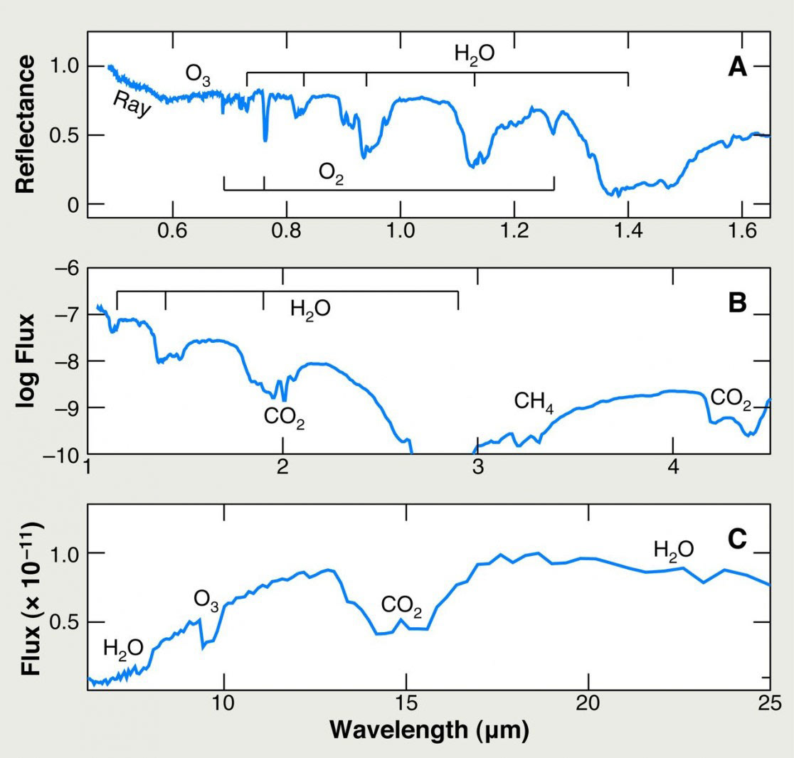
An example of the input data